PROJECT: DELISABATINI architetti
YEAR: 2010-2011
NAME: Guglielma
LOCATION: ROMA
CLIENT: private
COLLABORATOR: Arch. V. Pizzuto
PHOTOGRAPHER: Cesare Querci


DOWNLOAD:

PUBLICATIONS:
http://www.ar-edizioni.it/prodotto/yearbook-02/

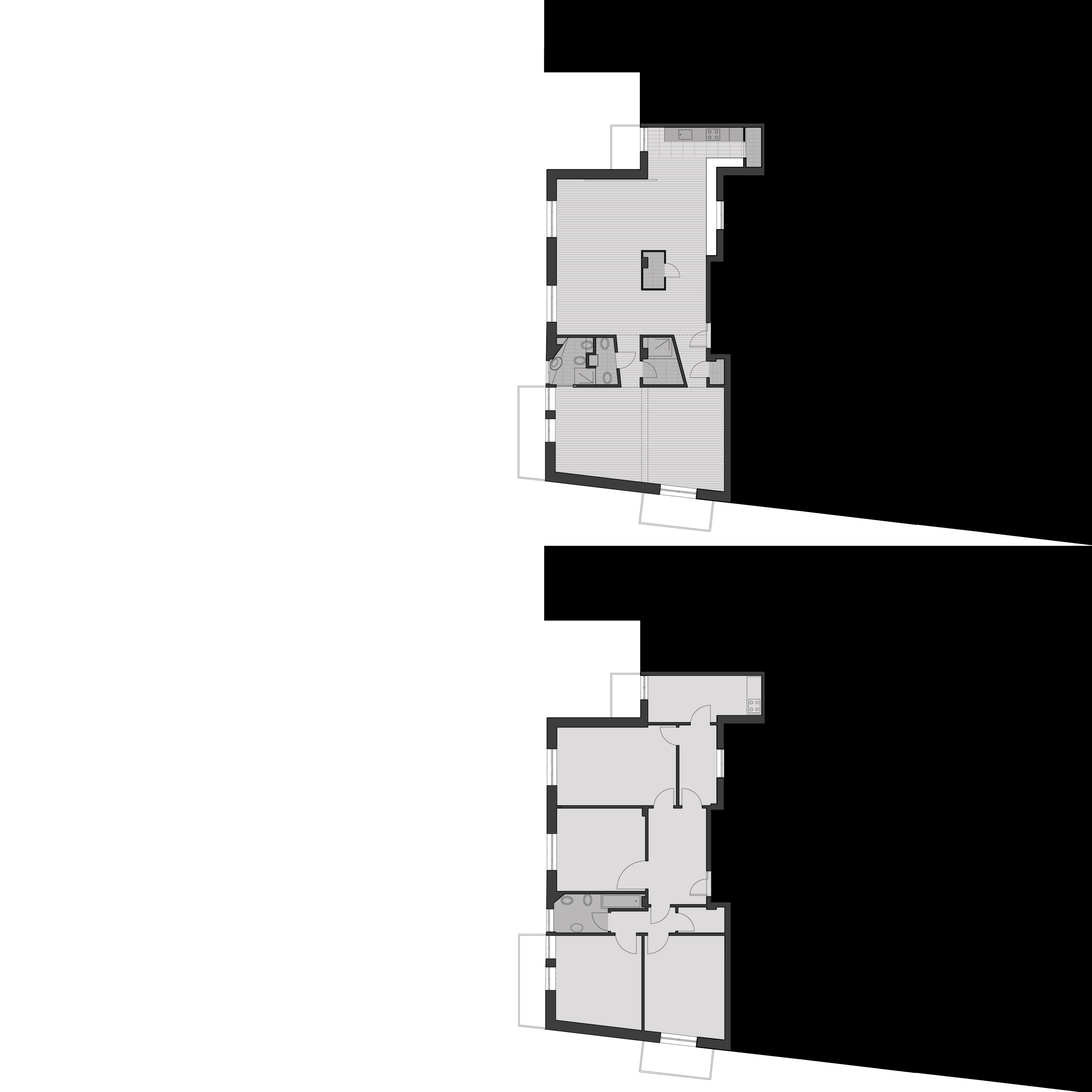
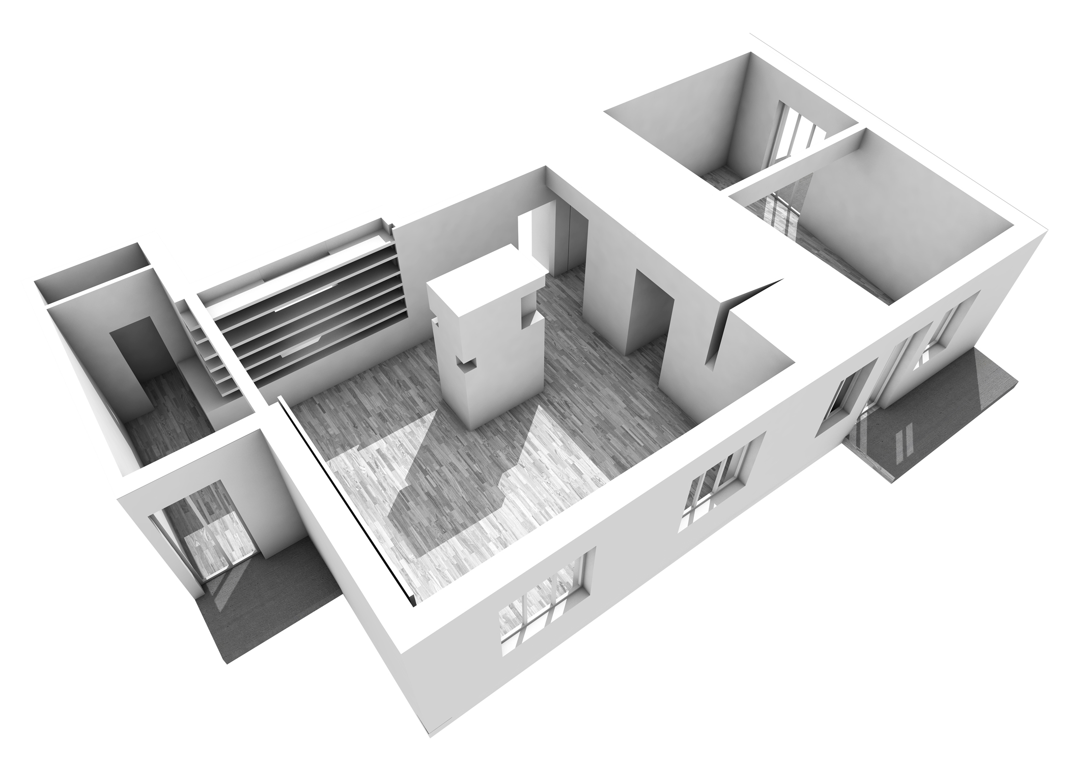
The intervention proposed the emptying of the original habitation from its internal partition designed during the 50 as a cluster of different adjacent spaces, closed rooms following a fragmented spatial logic.
The project aimed to reorganize the living areas as functional parallel stripes following a space continuity concept to organize them.
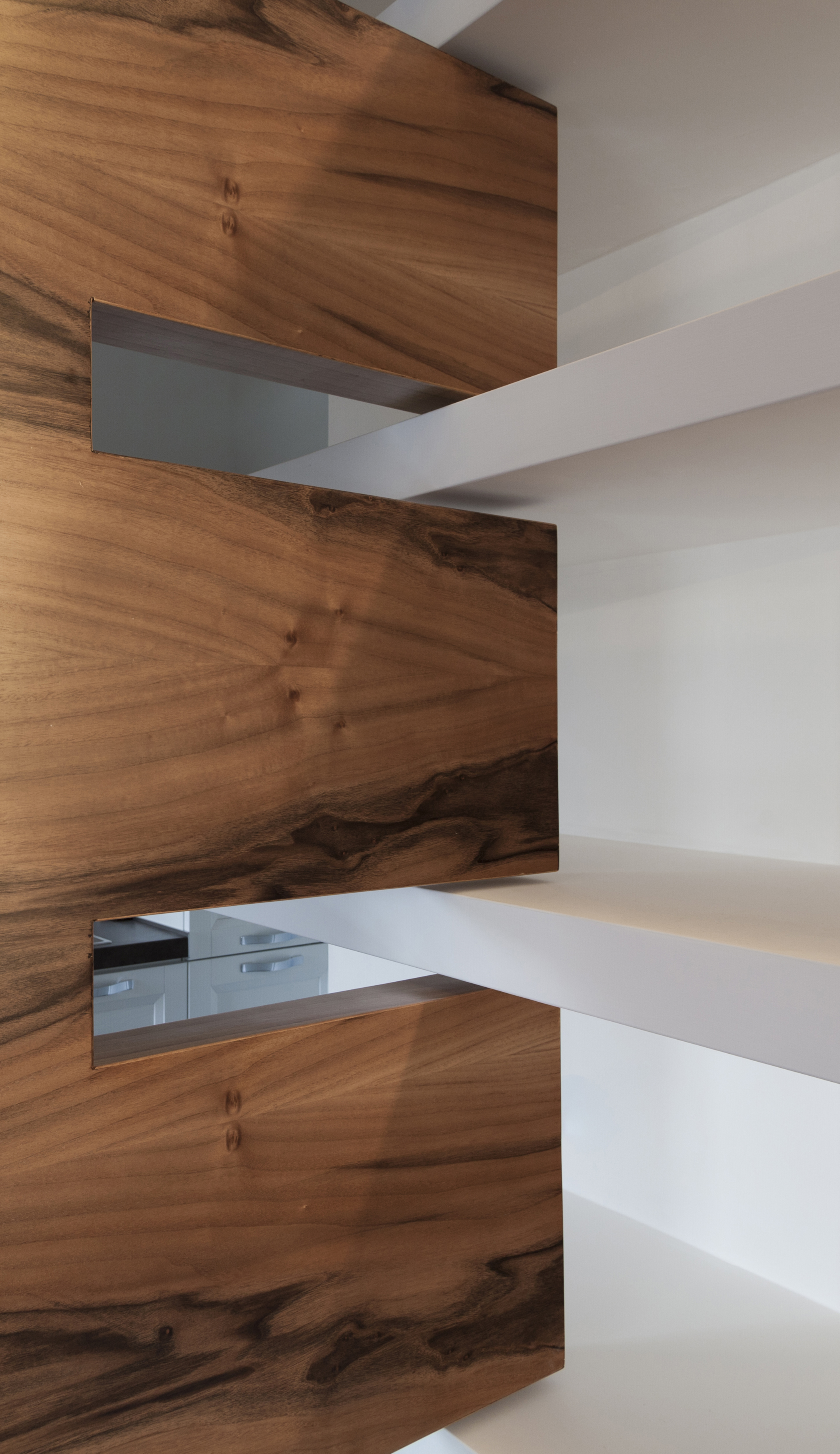
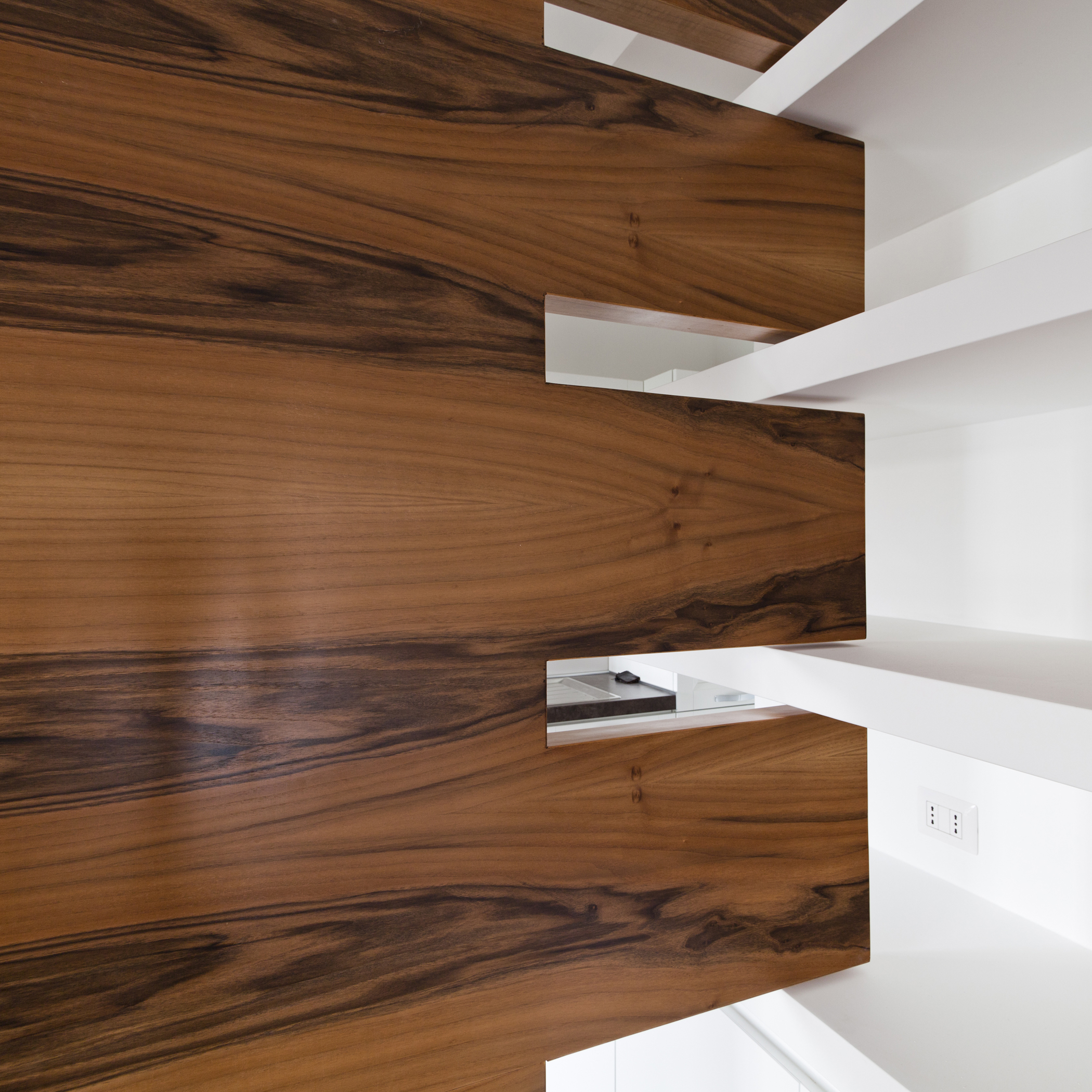
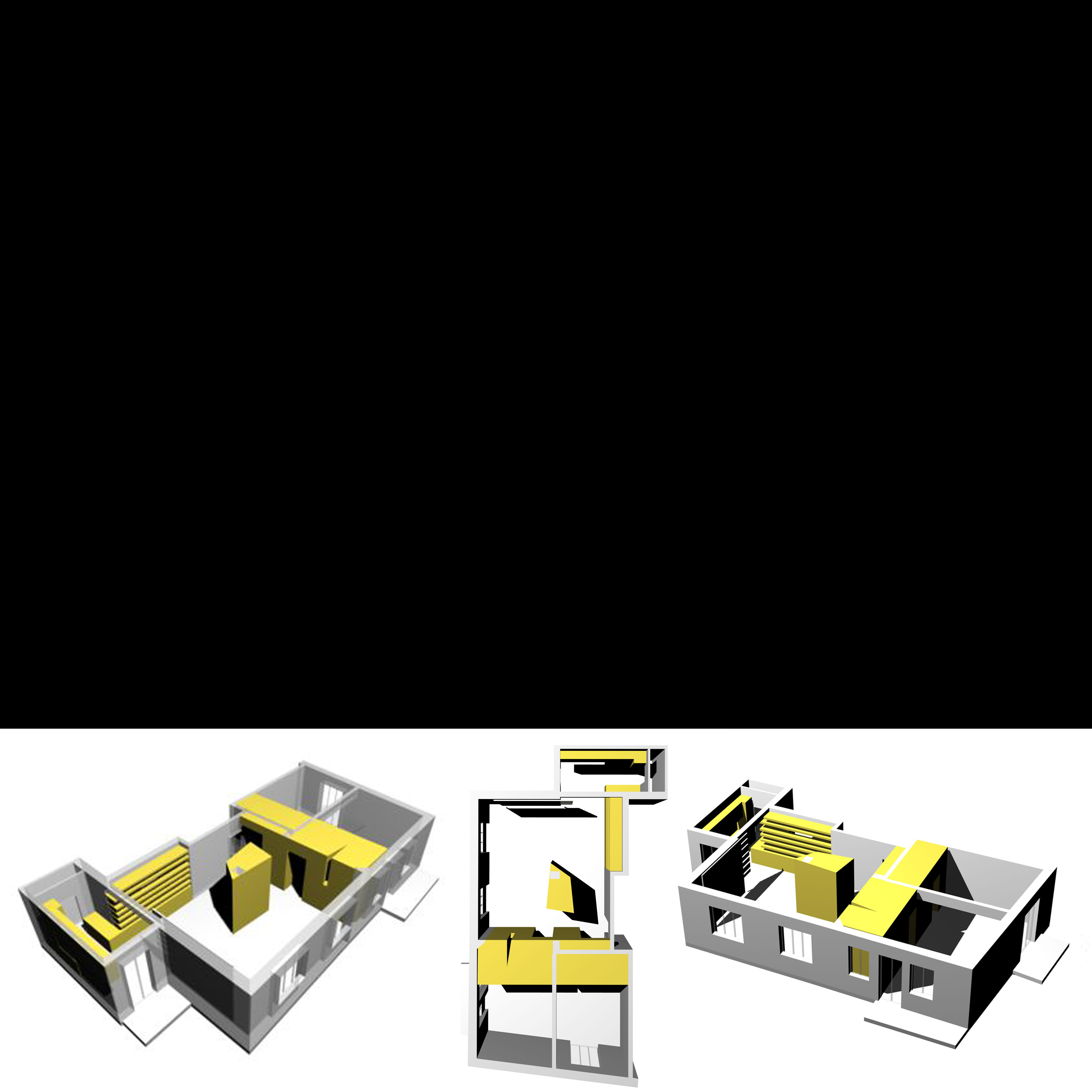
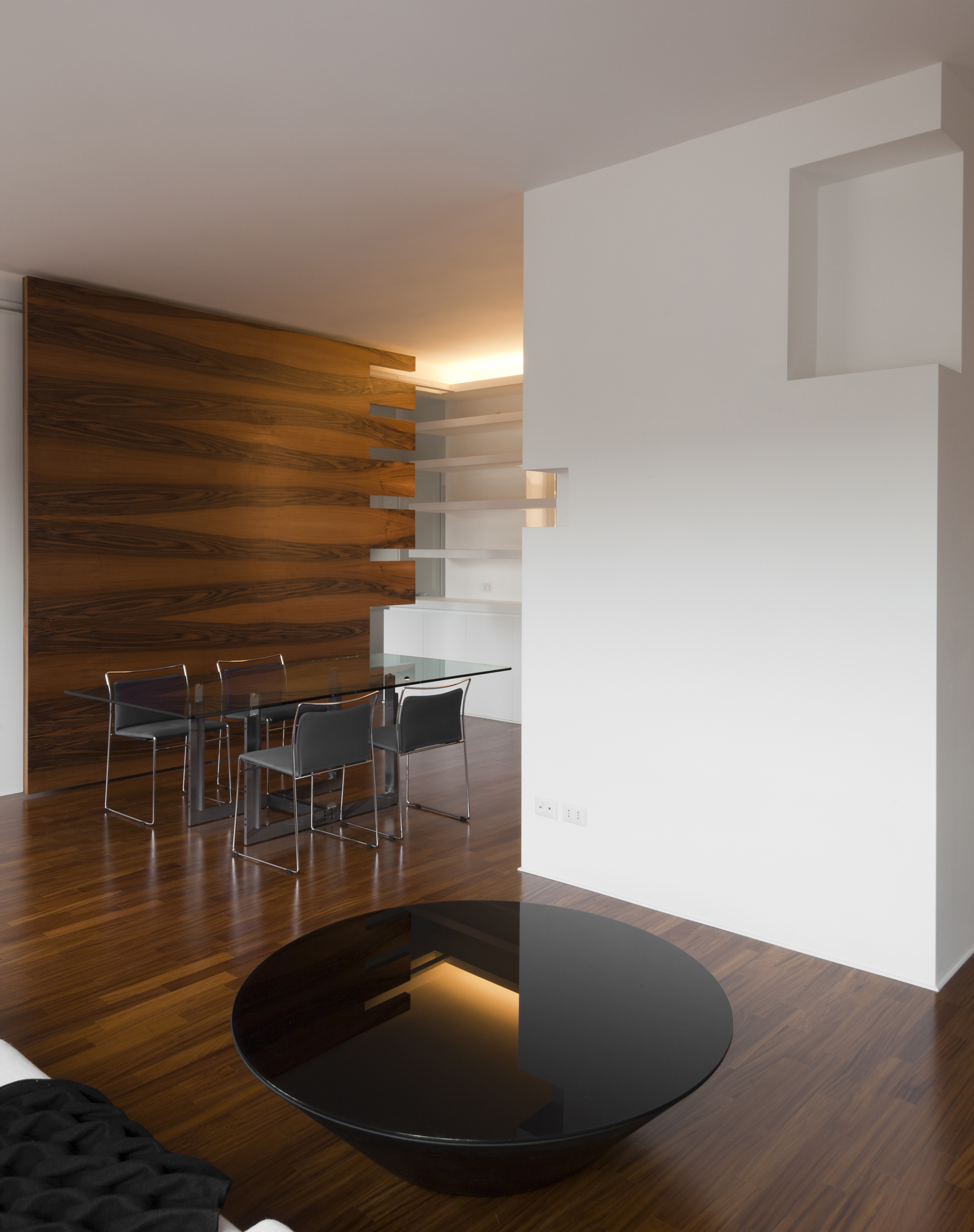
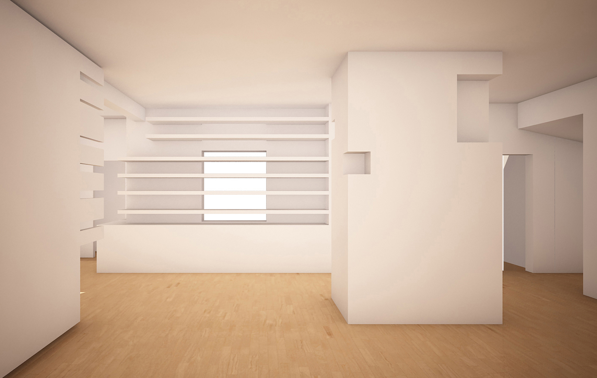
The architectural elements that redesign the space are basically four: the service volume, the masonry bookcase, the hollow septum, and the sliding panel.
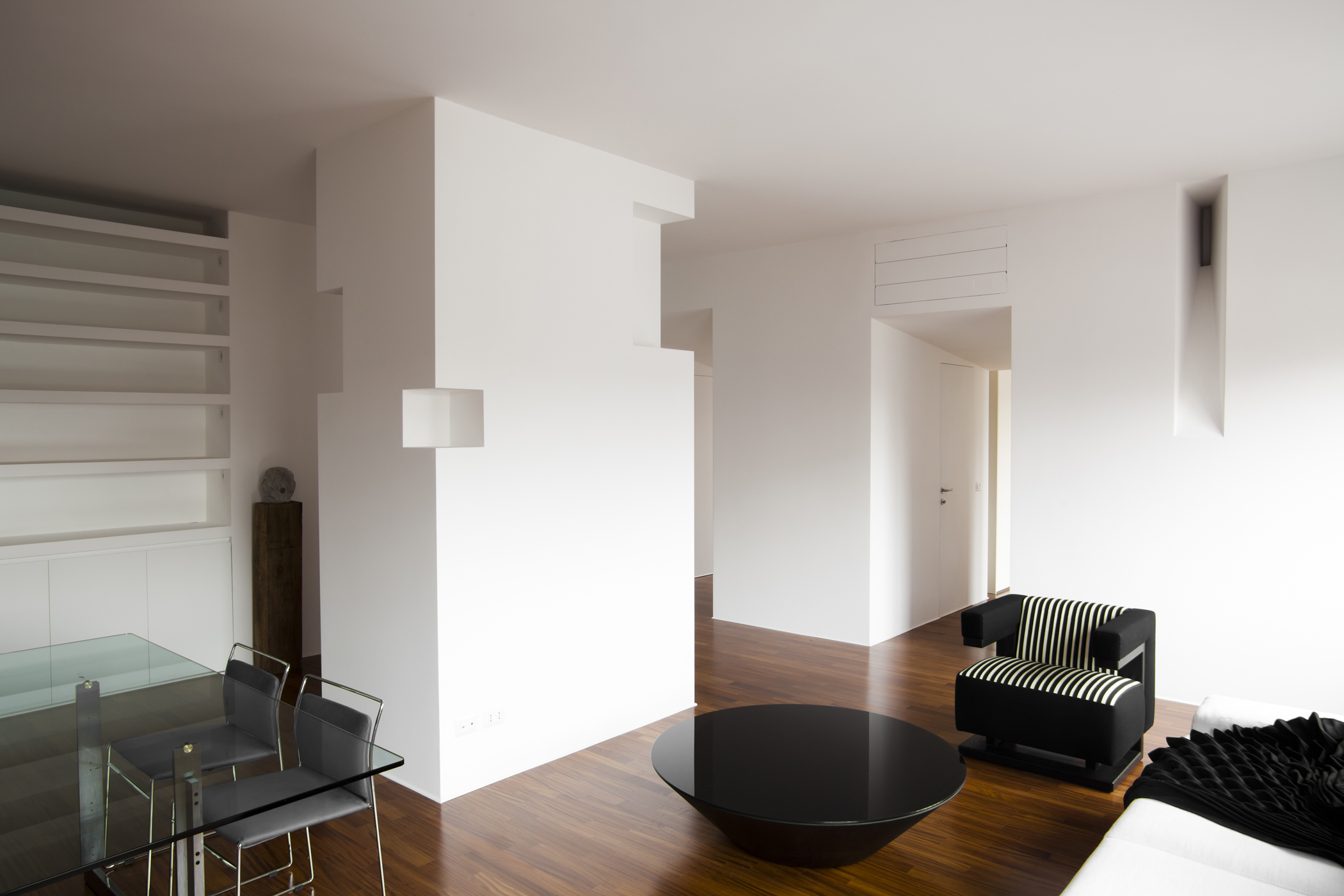
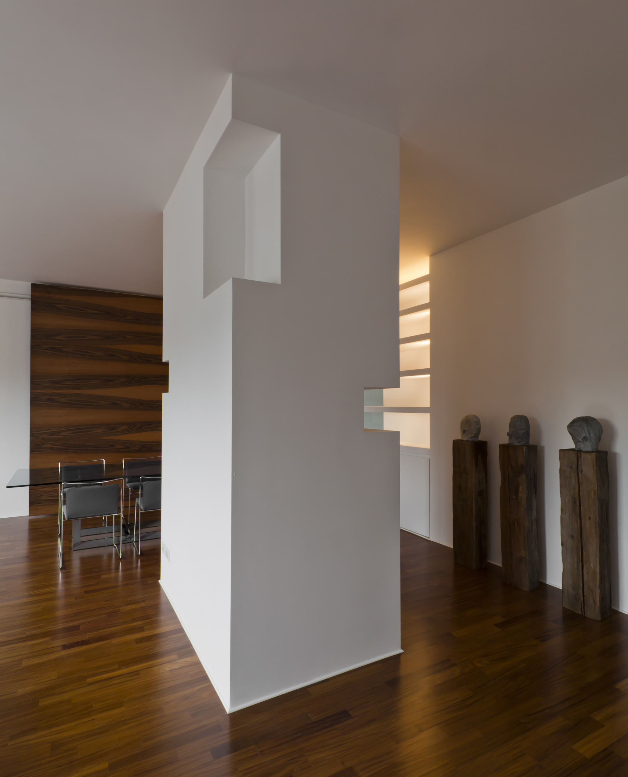
The main theme is the hollow septum here used in a domestic environment. This inhabited septum follows the orthogonal arrangement of the house organizing the space in parallels functional stripes of different dimension (sleeping, living, facility, and kitchen).
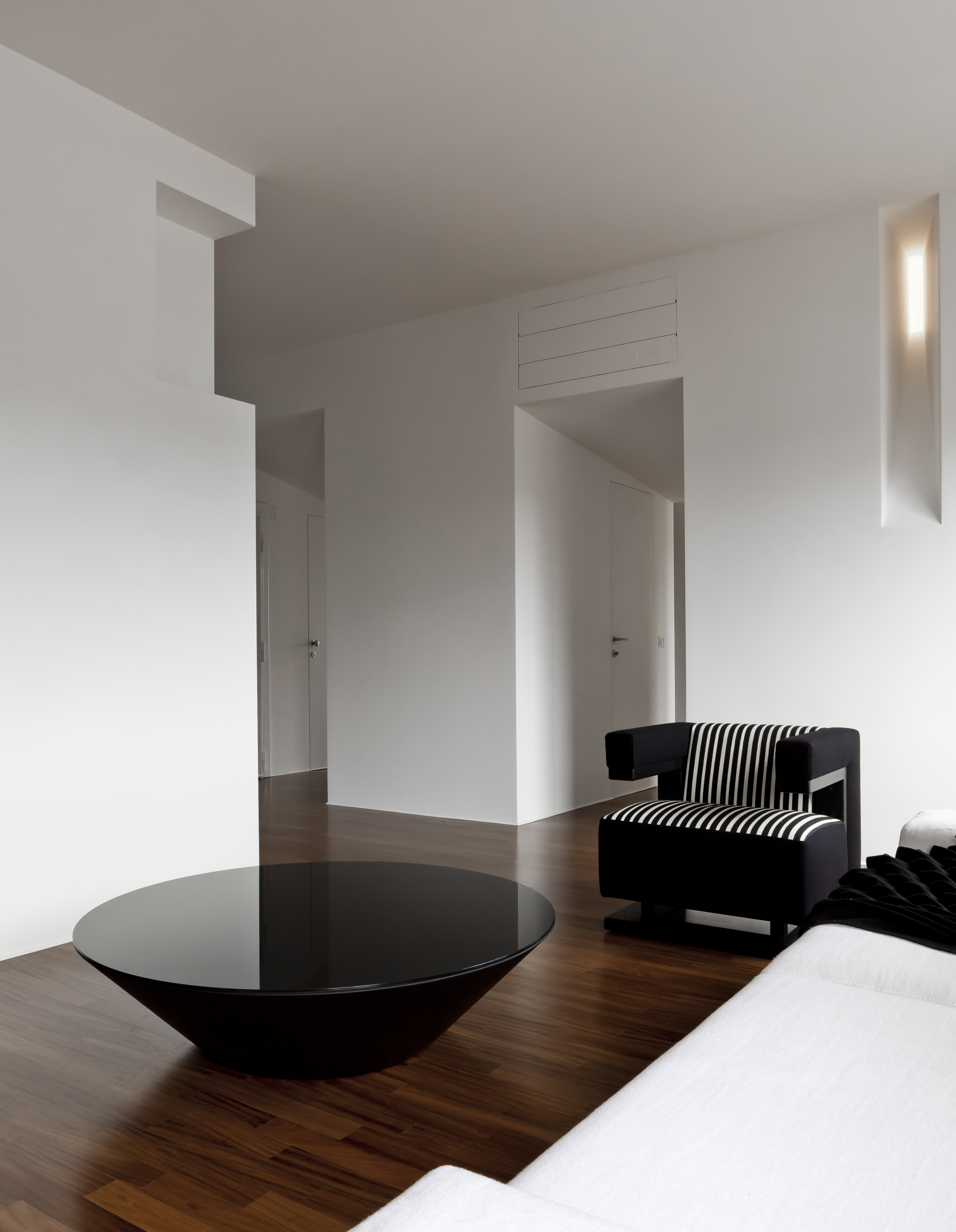
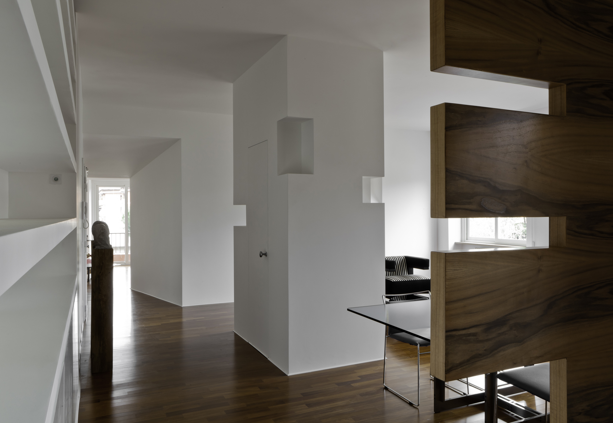
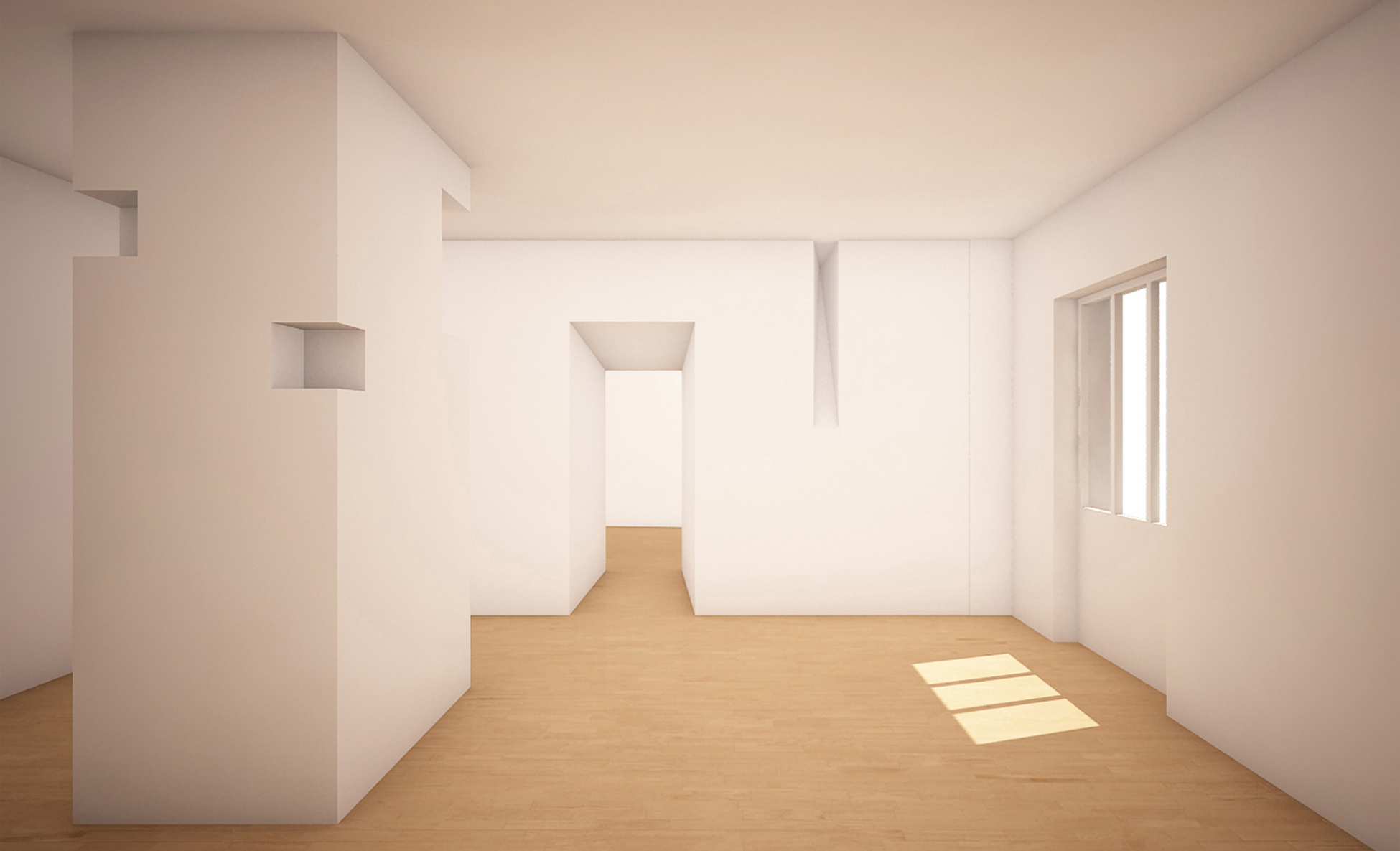
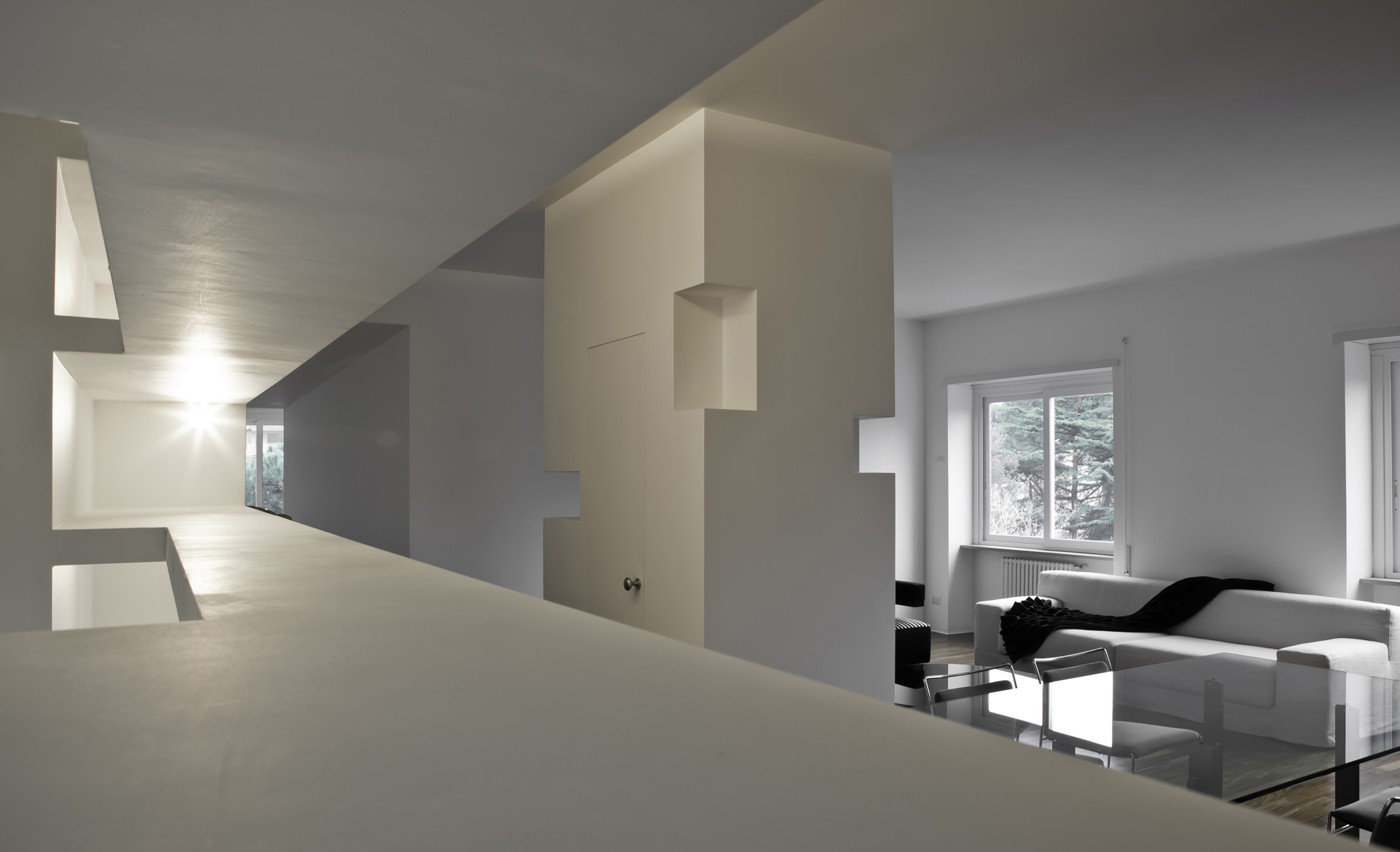
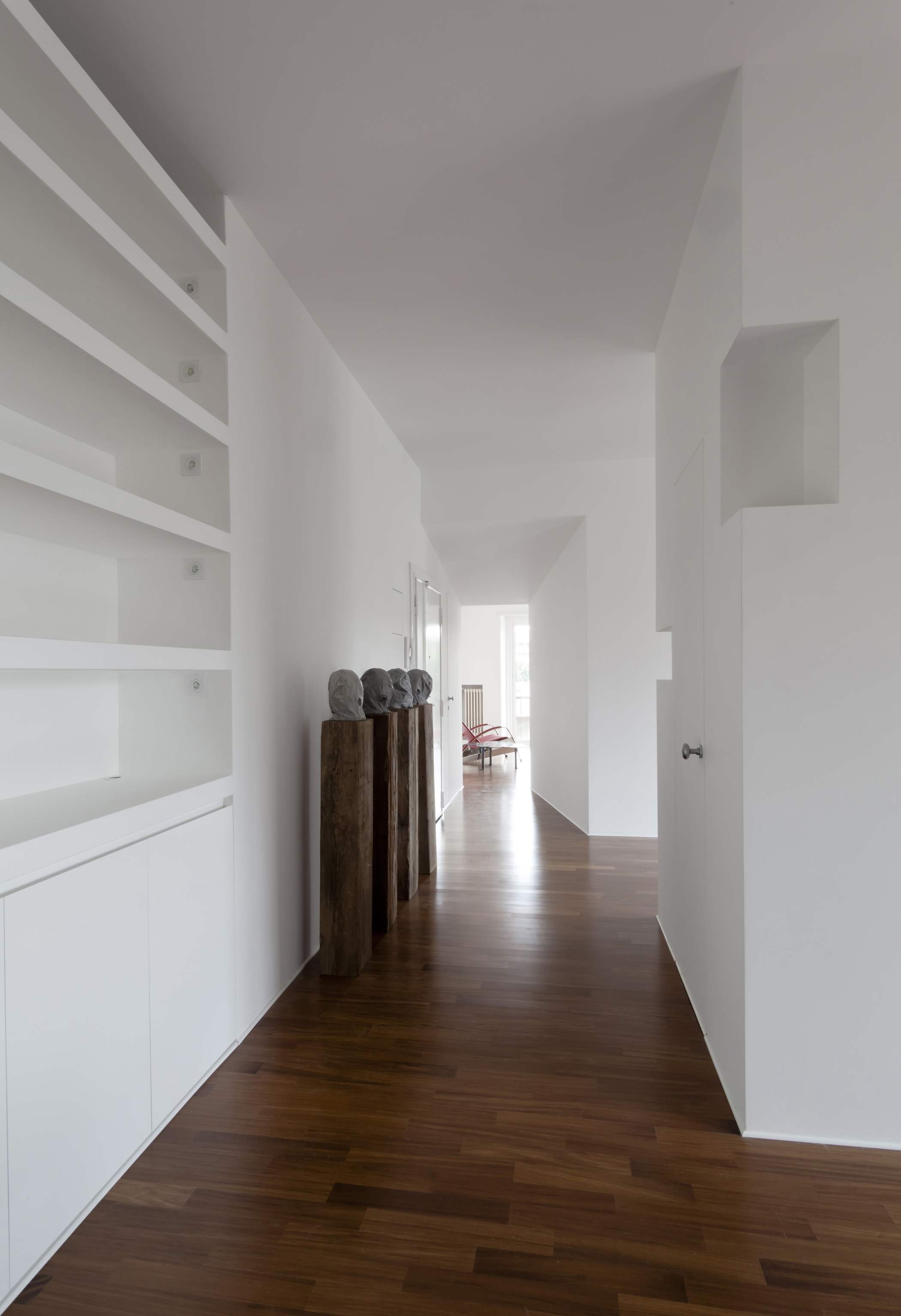
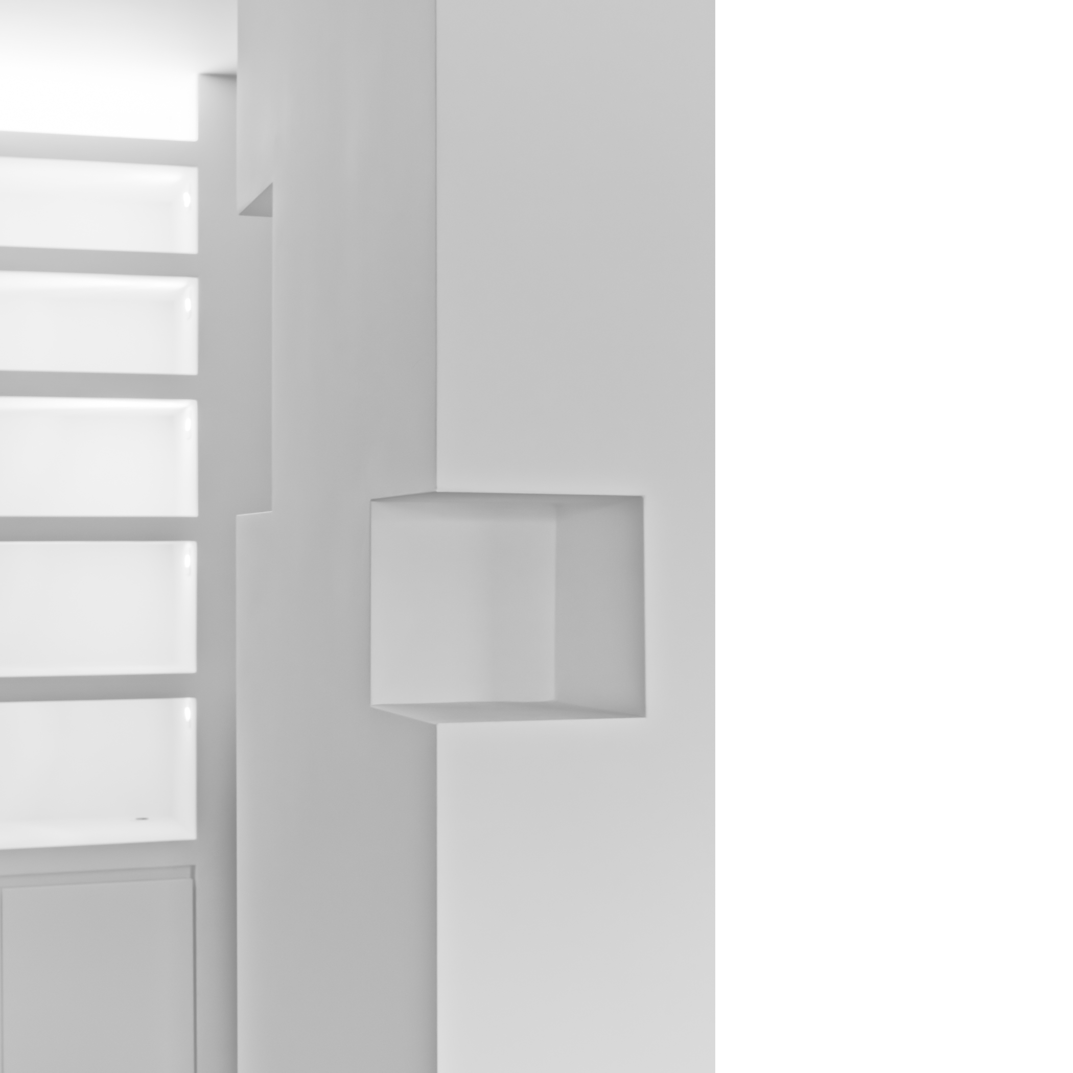
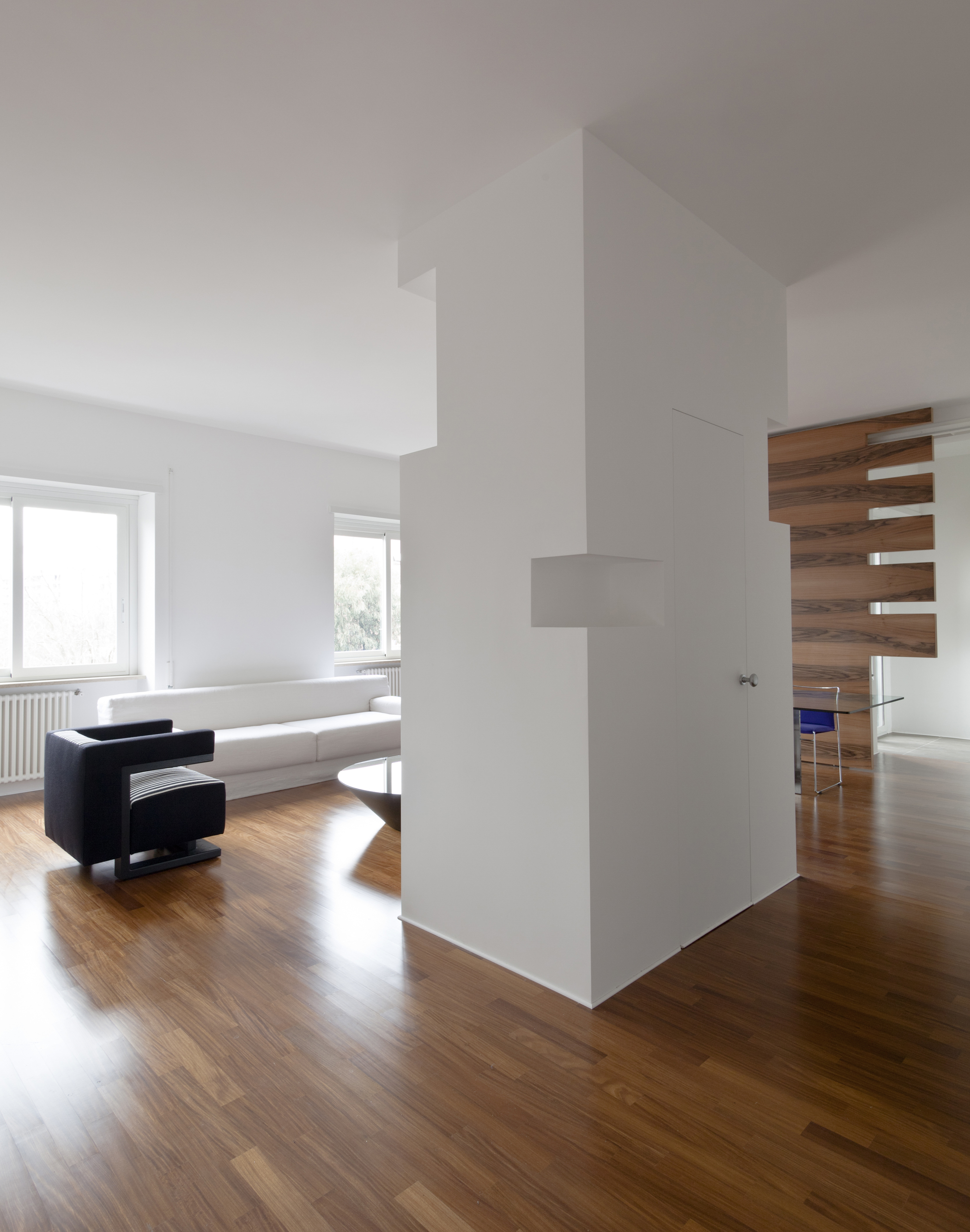
This facility septum is also a plastic element that with its dimension and depth reminds to the ancient wall’s dept. Its mass, containing bathroom and closets, is engraved by visible splayed marks that permit the pass by and serve as filters between living and sleeping areas. The splays create protected ambits between the living and sleeping area and the facility and focus the visual attention through the entire house. The hollow septum, without blocking the space, ensures the flexibility of the sleeping area that could be organized as a unicum or divided into two rooms.
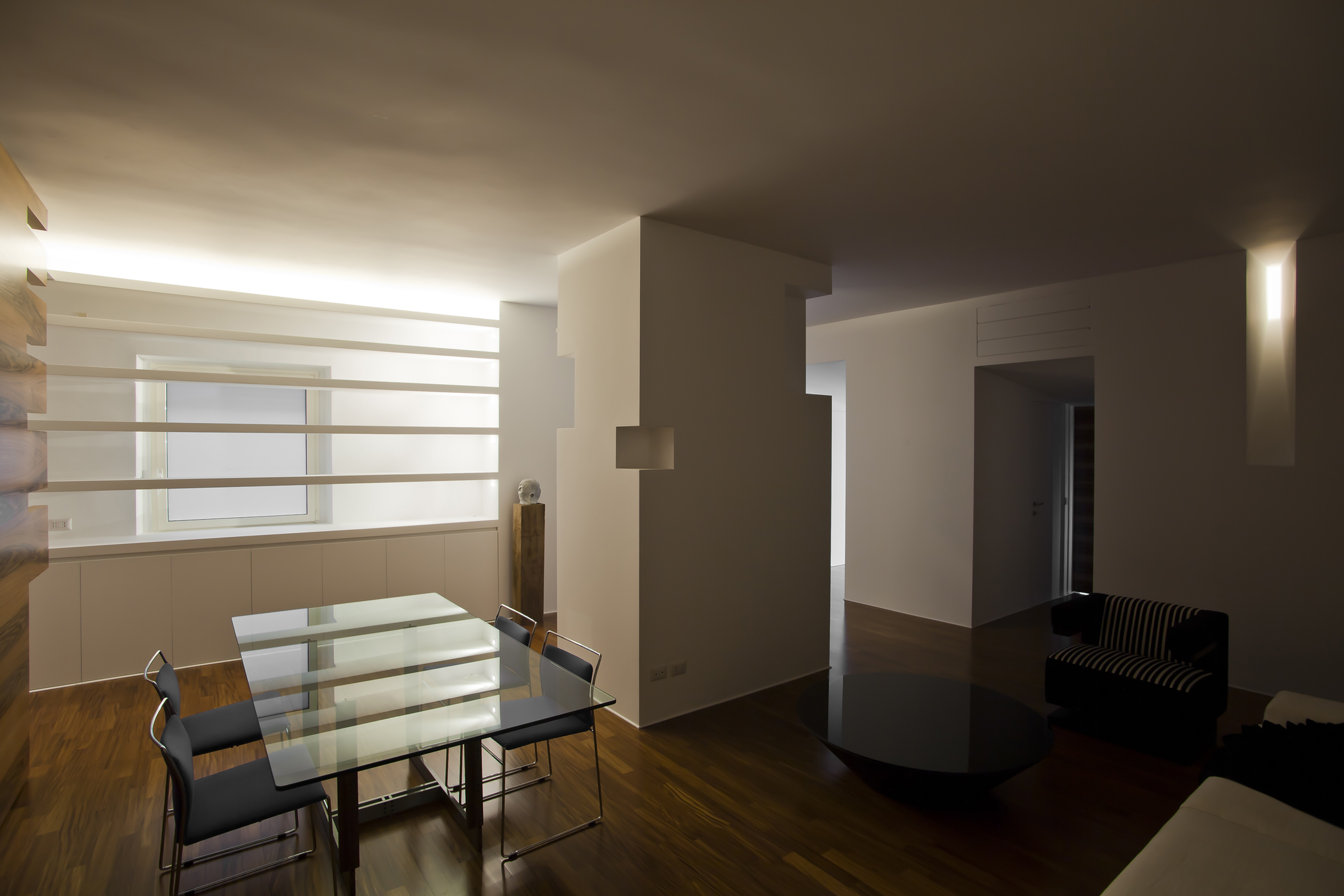
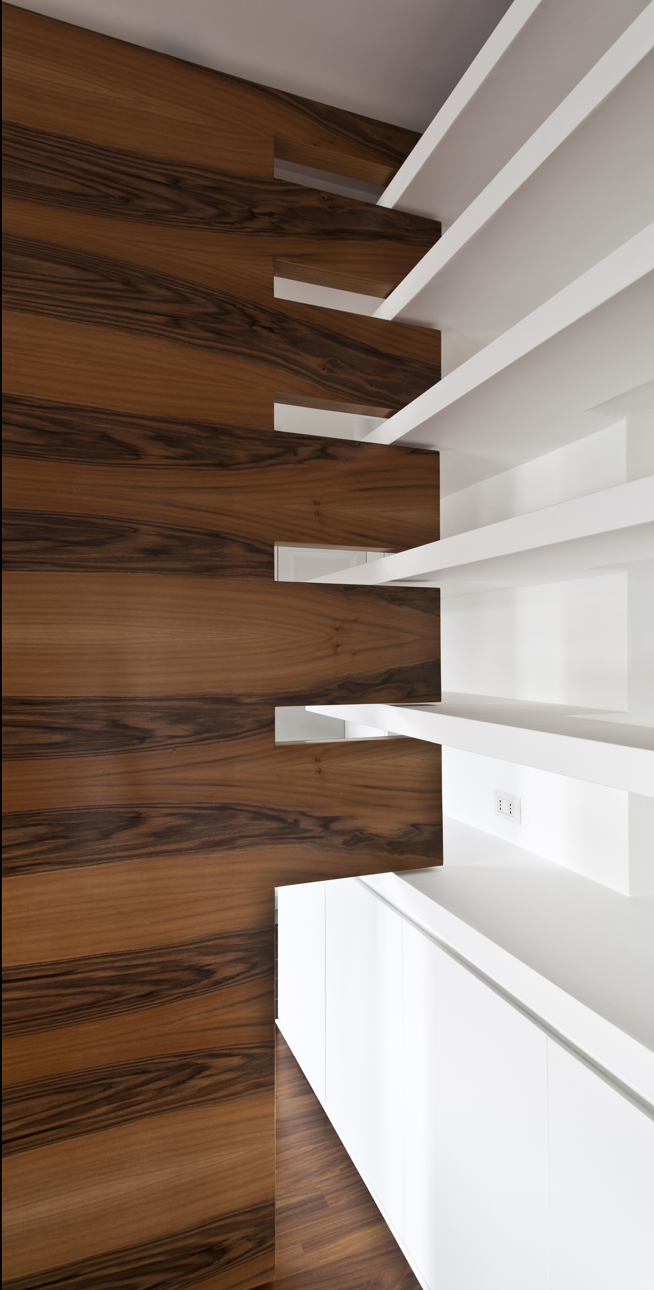
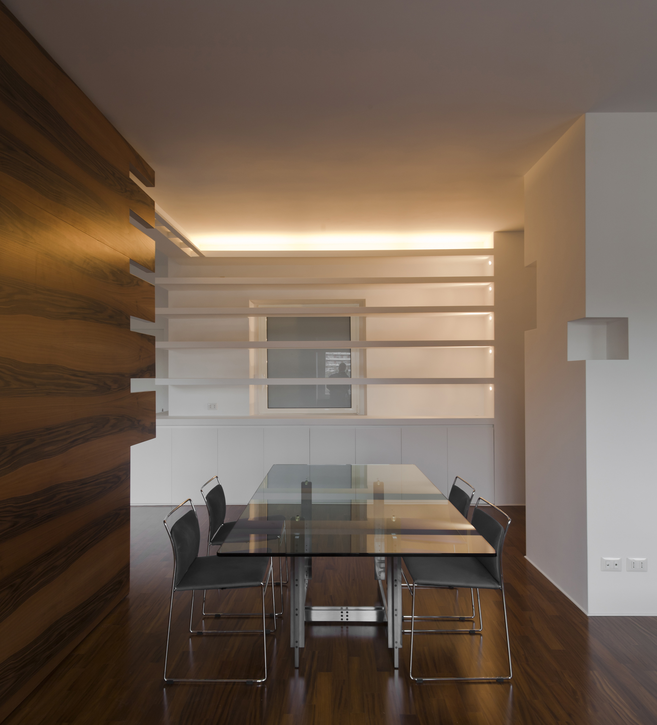
The “blades” of the bookcase enhance the perspective orthogonal to the septum and contribute to the entrance wall dematerialization.
The living room, wide and bright, is inhabited by a hollow shape that organizes spatially and visually the space.
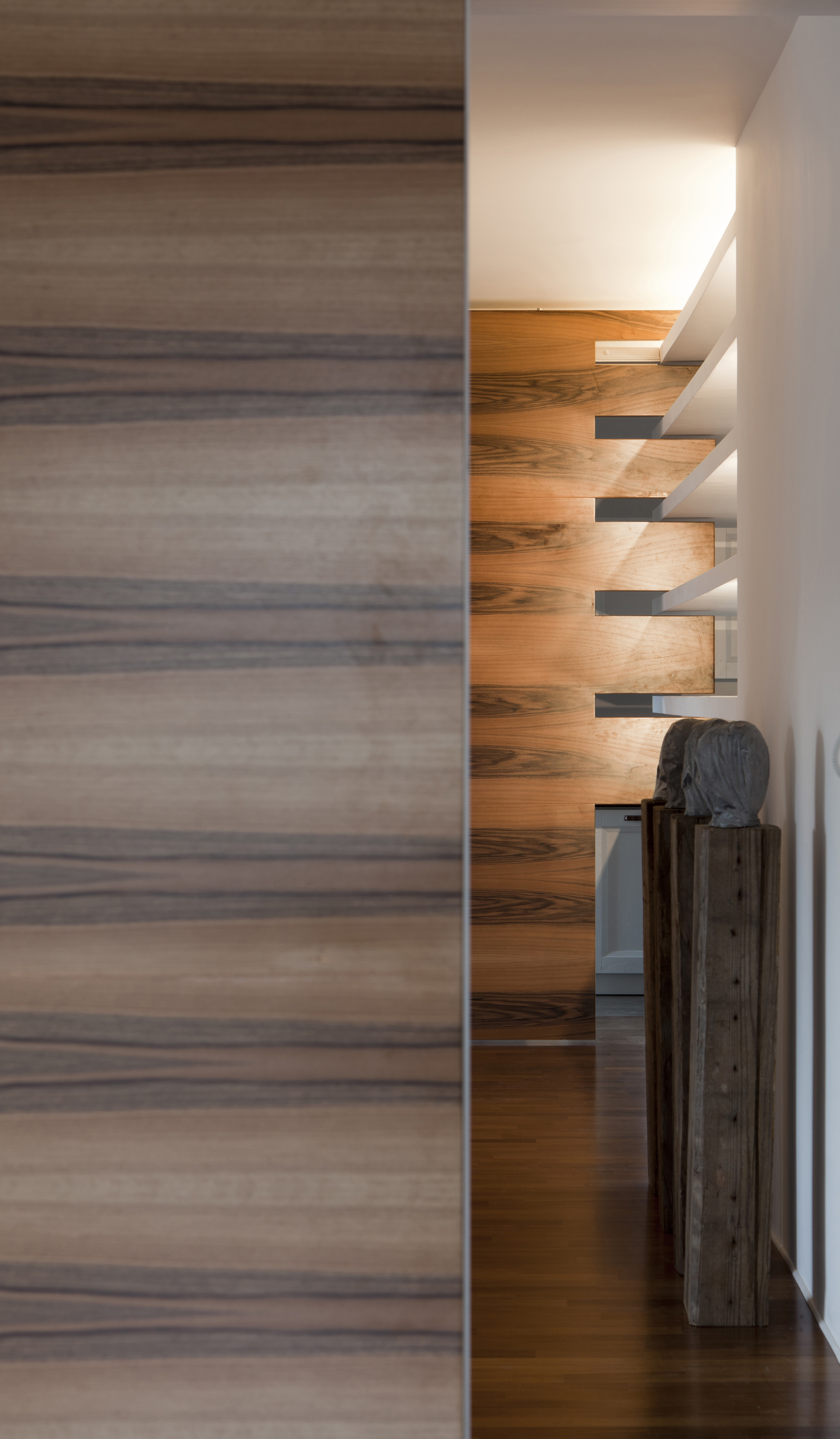
The big sliding panel, when closed, fits into the bookcase “blades”, when open includes the space of the kitchen to living room.
The intervention totally renewed the house functionally and architectonically increasing the living area and the number of bathrooms thanks to the suppression of useless partitions and corridors.
The light variation is one of the most interesting effect achieved thanks to the splayed passages and engraved marks.