PROJECT: DELISABATINI architetti + Arch. D’Andria + UTECO
YEAR: 2008
NAME: Concorso di Idee per l’allestimento del Museo del Pane
LOCATION: VILLAURBANA (OR)
CLIENT: Municipality of Villaurbana
COLLABORATORS: Federico Marchi, Giovanni Battista Manai


DOWNLOAD:

PUBLICATIONS:

The old Casa Lai, with its solid masonry structures faces toward the inside part of its walled perimeter.
 Interiors are characterized by different rooms in size and height; these compressed spaces overlook on quiet and protected stone courtyards.
The main idea is to modify as less is possible the existing building. Only a set-up will be inserted softly between the walls of the old house.
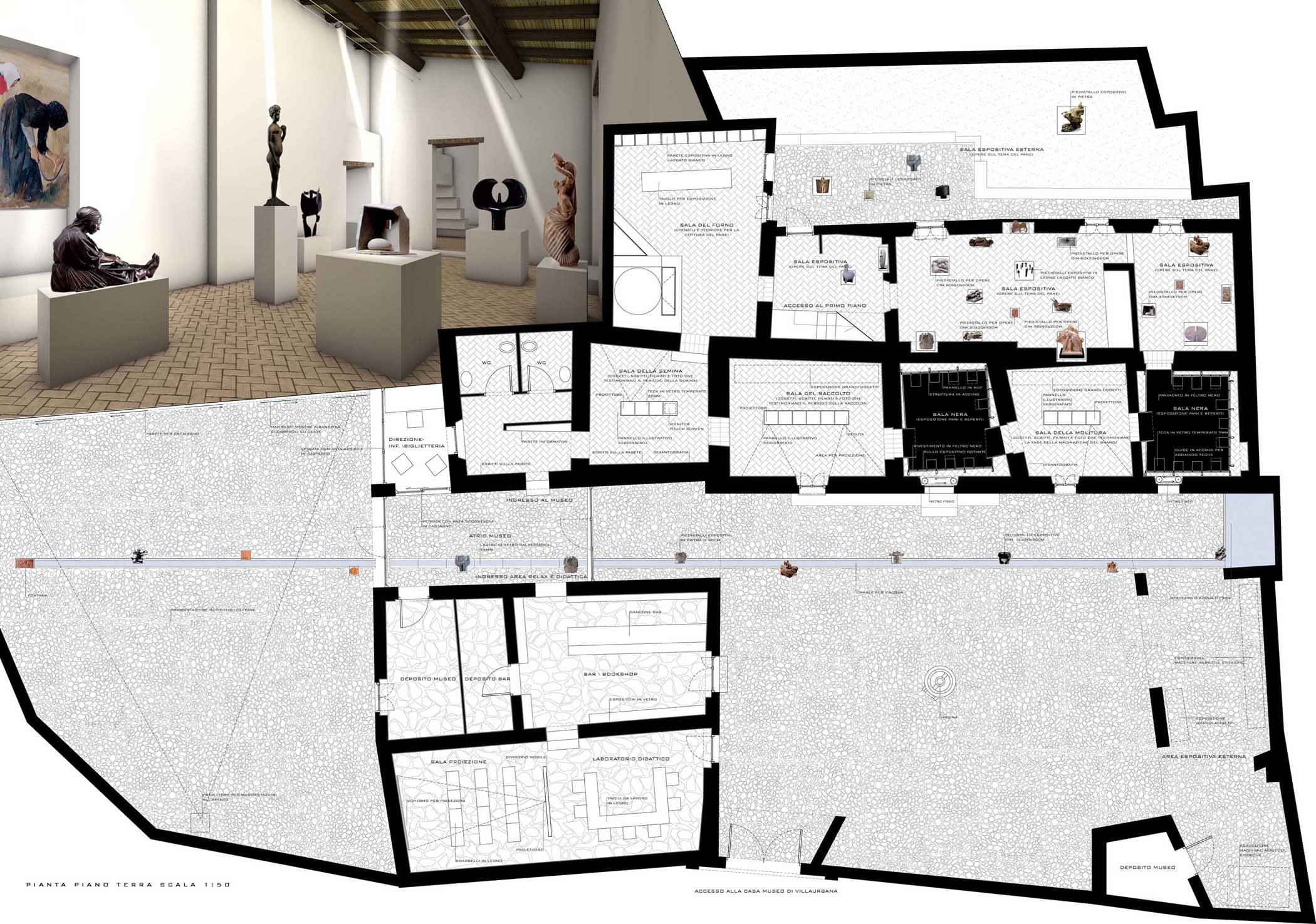
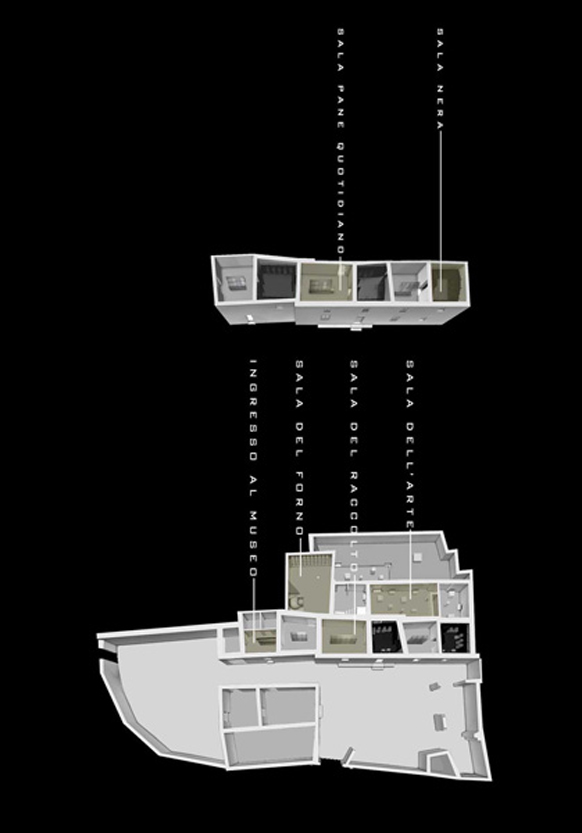
The design idea is based on the division in plan of the competition area with clear functional and parallel bands:
-a first band, that includes the two main courtyards, is suitable for temporary exhibitions and to host a  bar-bookshop, a projection room and a laboratory;
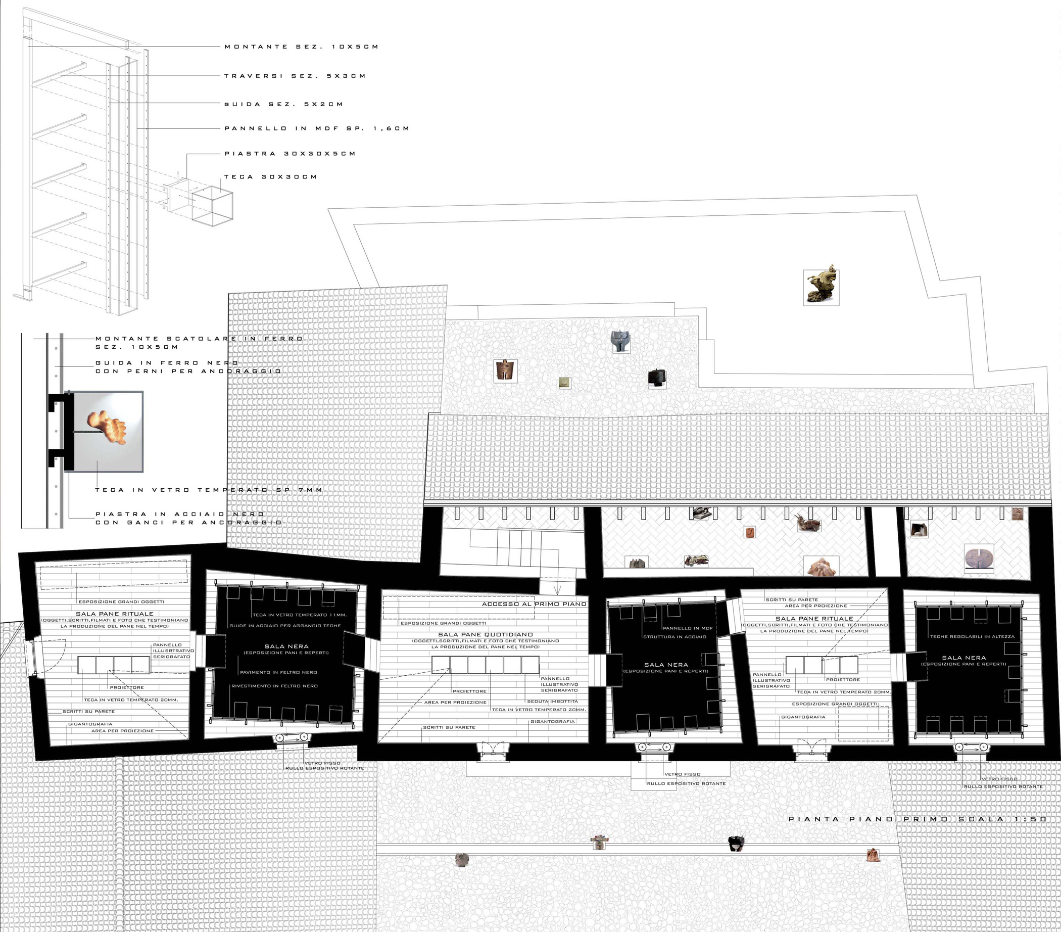
-a second band, that includes the inner body of the house, houses the exhibition section dedicated to the real cycle of bread; it is composed by a succession of aligned rooms;
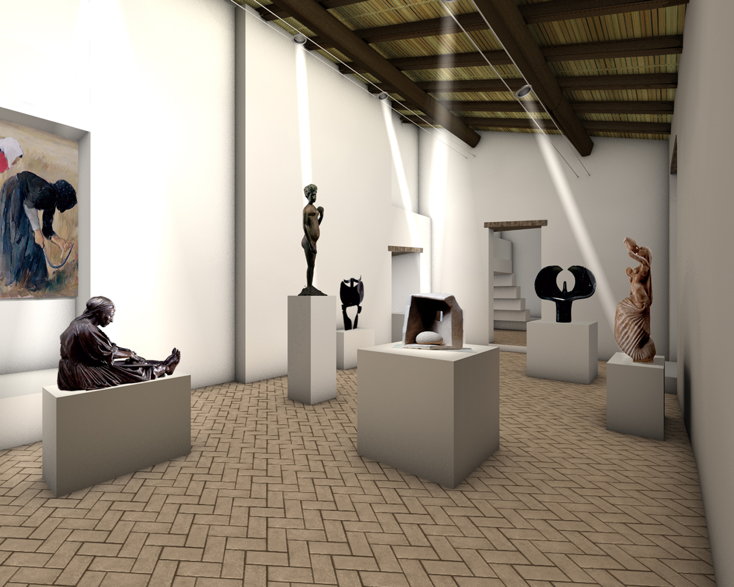
-finally, a third band, between the inside building and a small external courtyard, is dedicated to the permanent or temporary exhibition of art works relating to the theme of the museum.
The new intervention displays externally only with few elements:
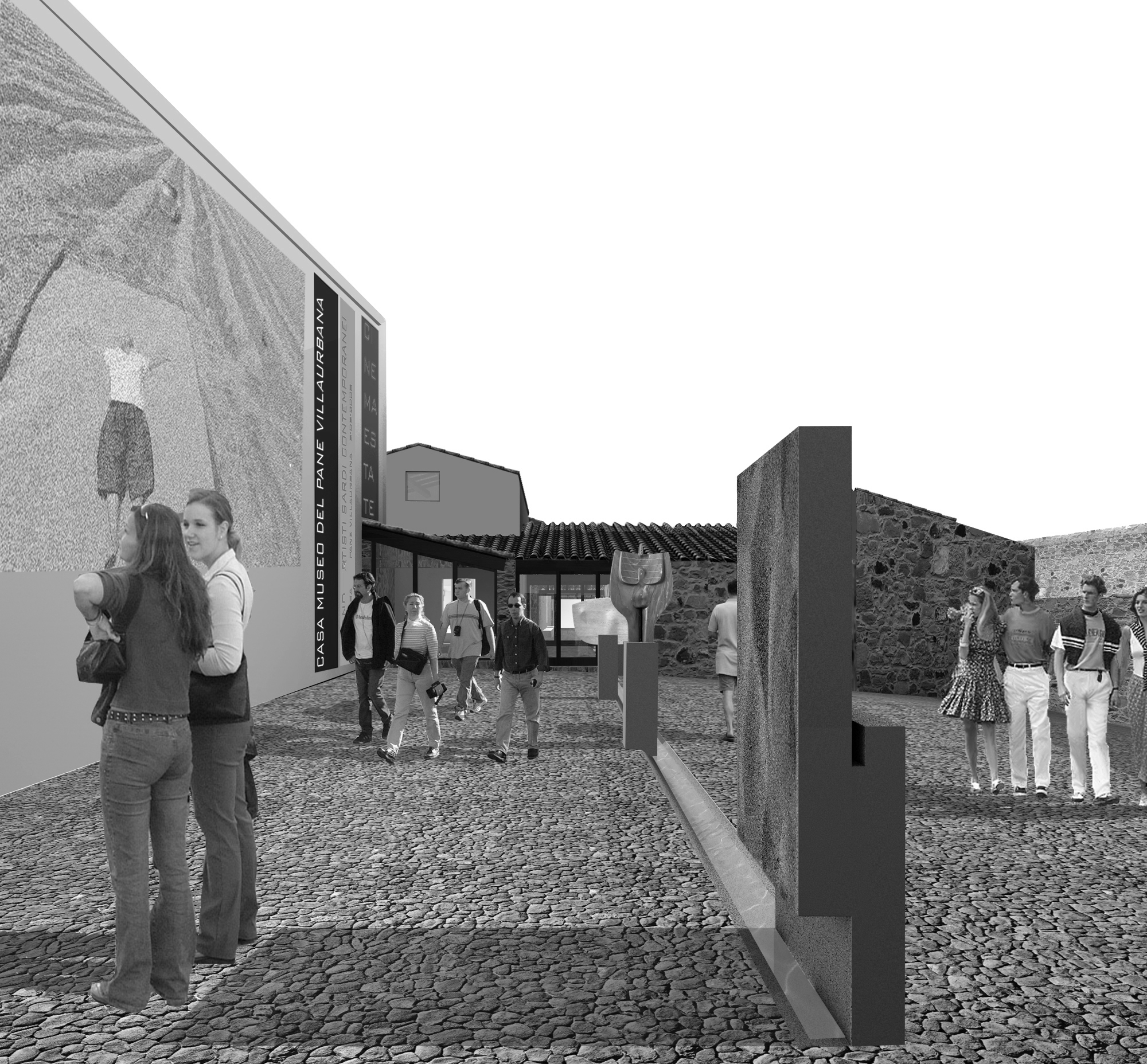
-a months fountain, a linear object that crosses and joins the two courtyards through the new entrance;
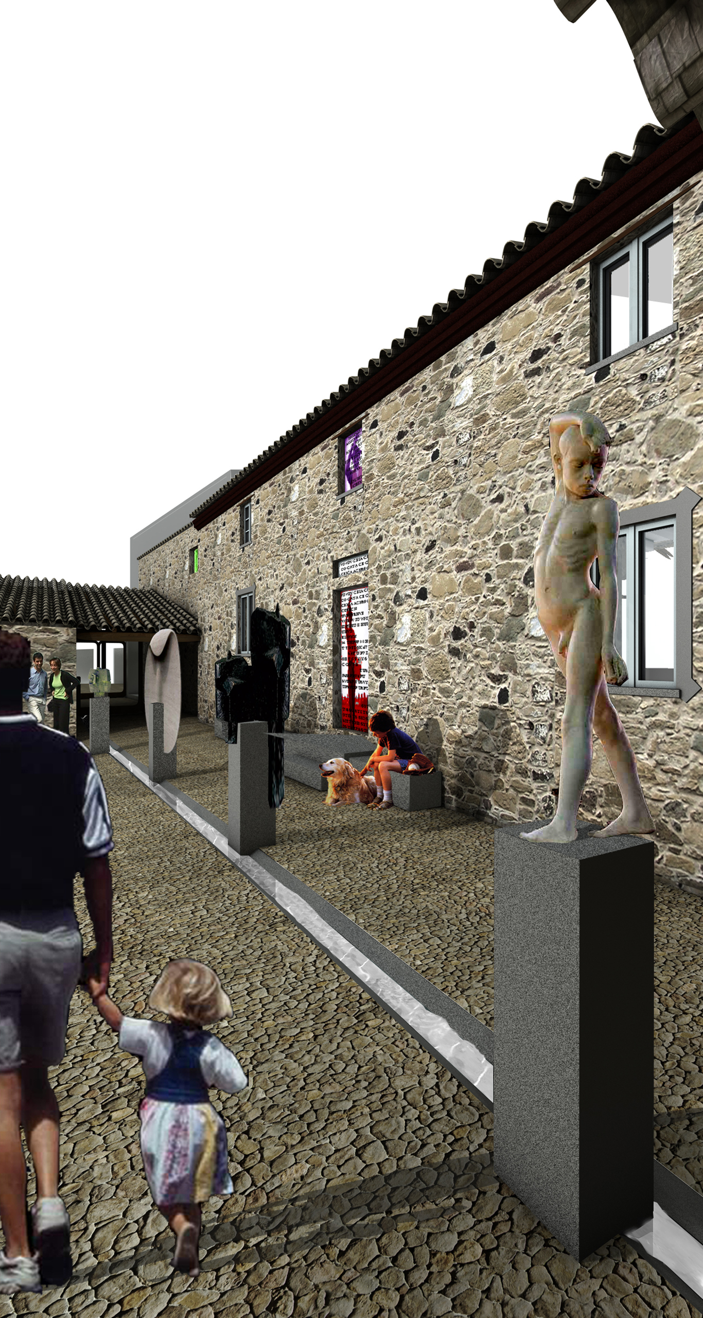
-a water sign in the floor, that animates and colonizes the courtyards with its discreet sound, flows between stones pedestals of twelve permanent works, including large ones, that evoke moments and memories of agriculture, ancestral rites and festivities of the bread cycle;
-five rotating panels, that communicate from the windows with passers-by. They send messages and images that are always different;
-an urban screen, a large blind wall, put on the intermediate courtyard, that thanks to high height it is visible in the urban landscape is used for outdoor projections.
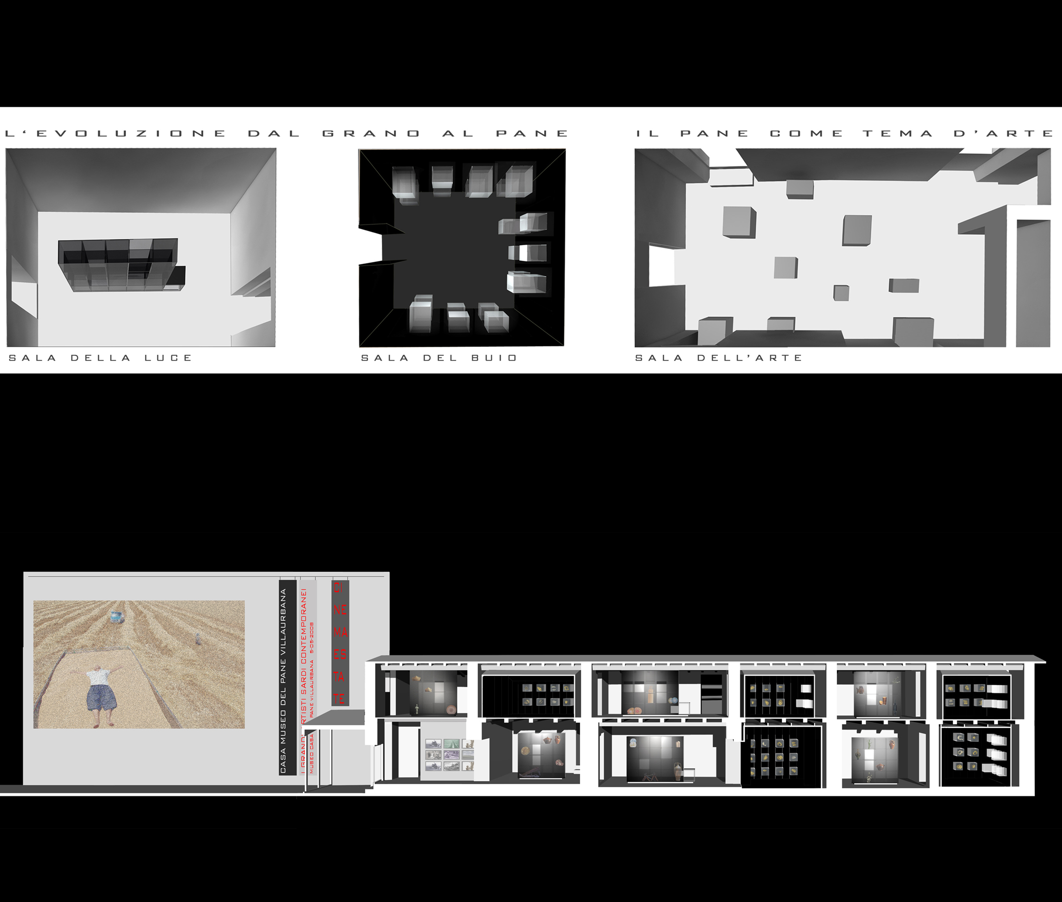
Inside, the museum set-up differs in three exhibition areas: the rooms of light and of darkness relating to the bread cycle and the rooms of art:
-the bread cycle is represented in a succession of alternately black and white rooms to illustrate  the passing of the seasons and to agriculture related to the creation of bread from the spikes;
-in the light halls there are the main moments of the cycle: on the ground floor the sowing, the harvest, the milling while the second floor is dedicated to female activity of bread-making, daily bread and ritual bread.
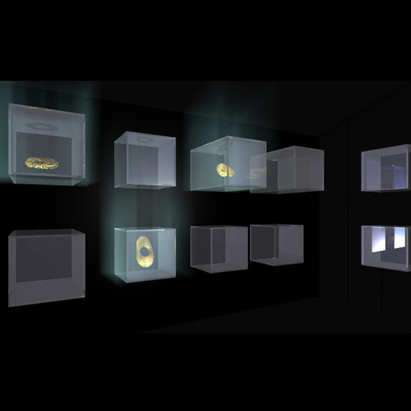
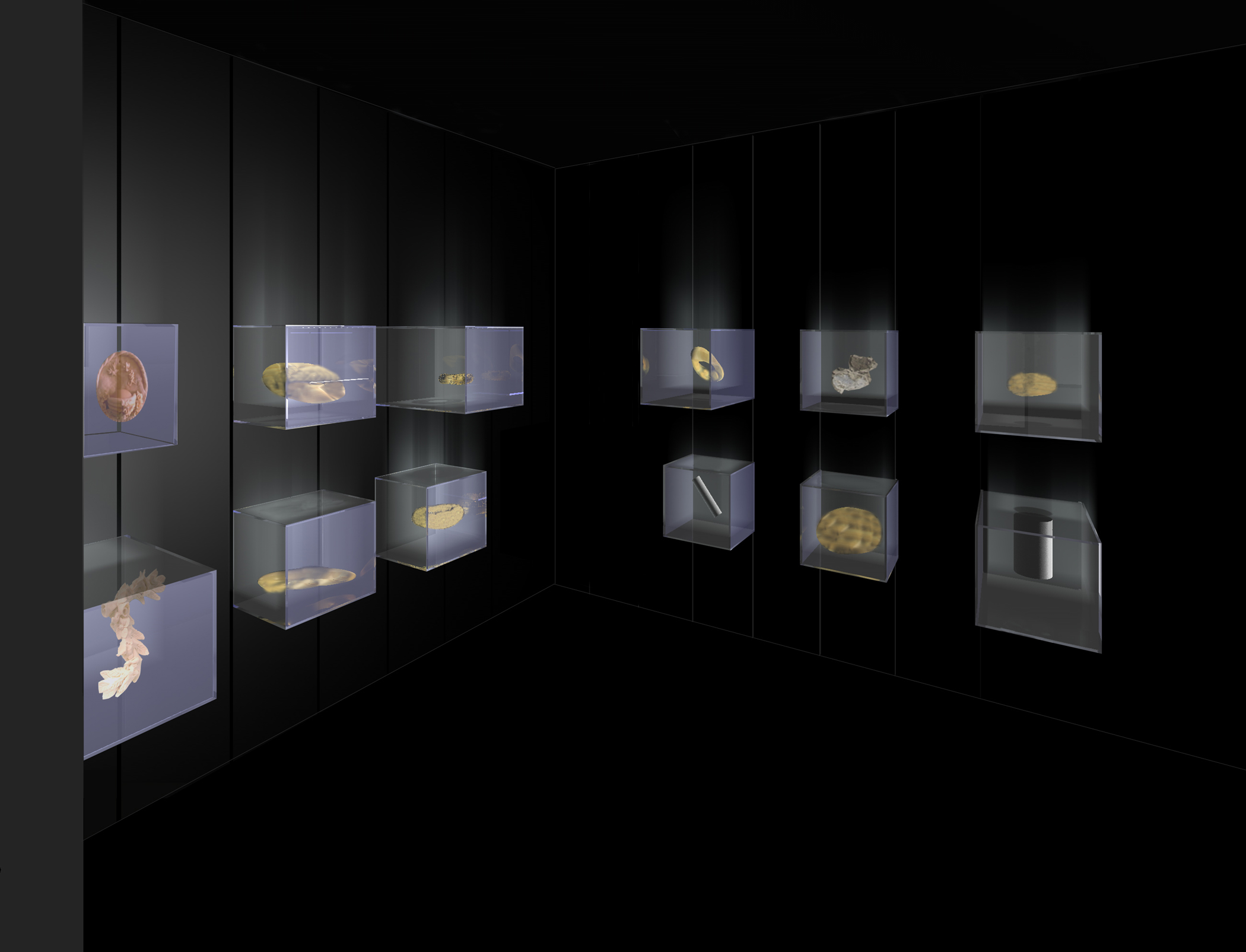
-in the black rooms visitor plunges into a rarefied and alienating space with muffled sounds where different bread types are presented as jewels within evanescent glass cubes.
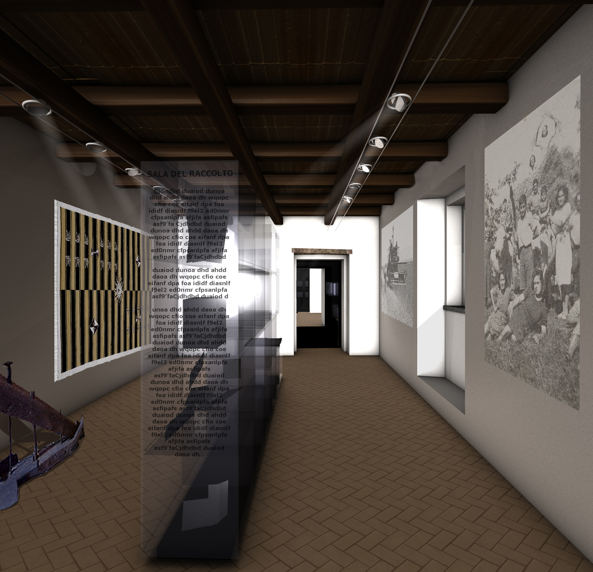
Light rooms, in the bread cycle, maintain the appearance of the existing rustic environment unchanged with its different materials, terracotta, plaster and wood, concentrating the display of objects and documents at the center of the space;
On the white walls, there are fragments of written texts, projections of photographic documents and related films, while large objects are arranged on the pavement.
In exhibition rooms, near rooms dedicated to the bread cycle, the art works are placed on pedestals of different sizes. They colonize the space of the three internal rooms and the small external courtyard indifferently, allowing visitors to pass through artworks.
